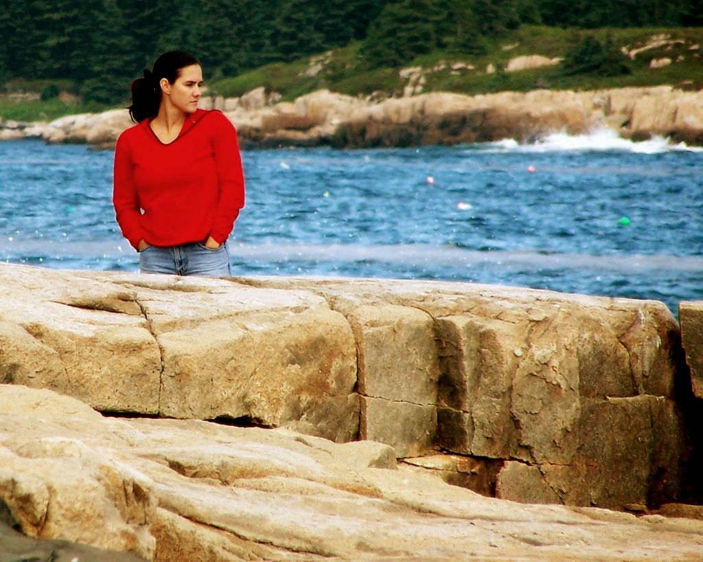
Seeing Red ...and scarlet and crimson and carmine
As the GEOGRAPHIC began to use color more frequently in the 1950s, editors wanted the most eye-catching hues to be employed, and photographers obliged. The result has since been termed the "Red Shirt School of Photography," named for the appearence of bright clothing in otherwise quiet color schemes.
Some photos raise questions: In a shot from February 1950 another shirt collar peeks from beneath the subject's red one.
According to magazine veteren Luis Marden, a pioneer of color photography, "The red shirt came to be associated with the GEOGRAPHIC because very few but the GEOGRAPHIC published color. It's easy to criticise the past - the trouble is we're doing it by today's standards." - National Geographic, November 2000. V 198, N 5


Very cool photo and story. Thanks.
ReplyDeleteNeat background to a neat shot! Love the use of colour in that one, Jeff.
ReplyDeleteann: I think we've met.
ReplyDeletealex: Yeah, I'm real happy with this one, although I don't think my subject would be. Well...if she found out about it. IF YOU DO NOT WANT YOUR PHOTO TAKEN, DO NOT LOOK GOOD IN PUBLIC! (That's what I always do)
Great shot. I was about to ask was this posed. I get really mean looks every now and then when I take shots on the street.
ReplyDelete